Terminal Overload – logo, colors
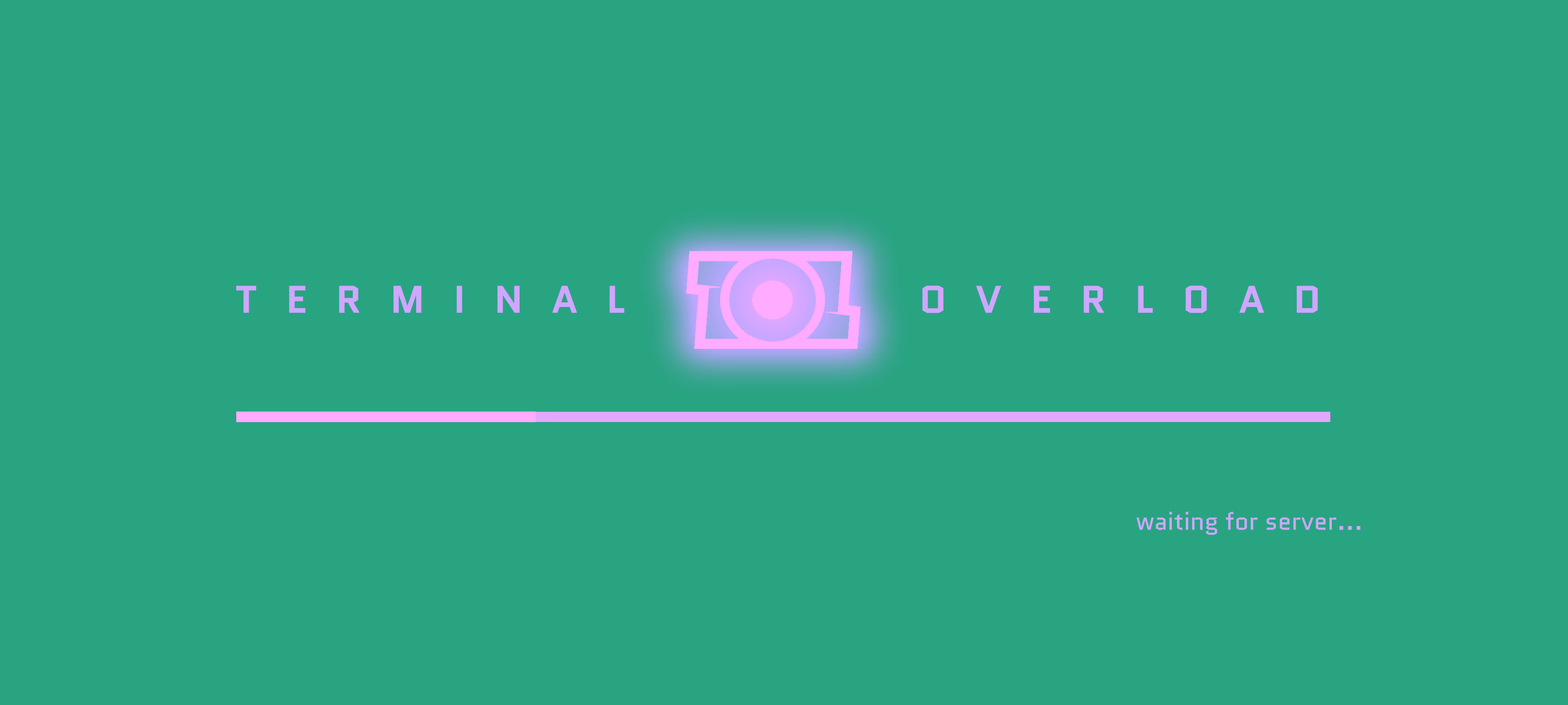
Terminal Overload was a multiplayer FPS featuring a fast-paced game and two teams fighting each other. The logo incorporates the idea behind one of the most iconic weapon in the game: the disc. It can be hurled towards enemies, finding its way to the target on its own. To make the logo go round and round – just like the disc – the games initials are arranged point symmetrical around the "O". The extra slant on the letters "T" and "L" accelerate and underline the spinning dynamic.
Stylistically the logo leans on the games overall minimal cyber-world look – with straight highlighted edges and simple geometry.
The color palette has a basic coding in mind, separating the world from teams and its players, items and effects vs. general effects to make the screen easier to read.
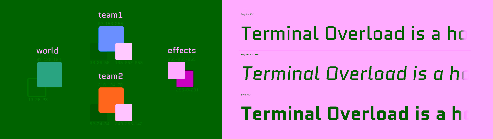
The font "Quantico" (SIL) used throughout the games interface echoes the concept of hard edges and futuristic minimalism.


