Librecast – logo
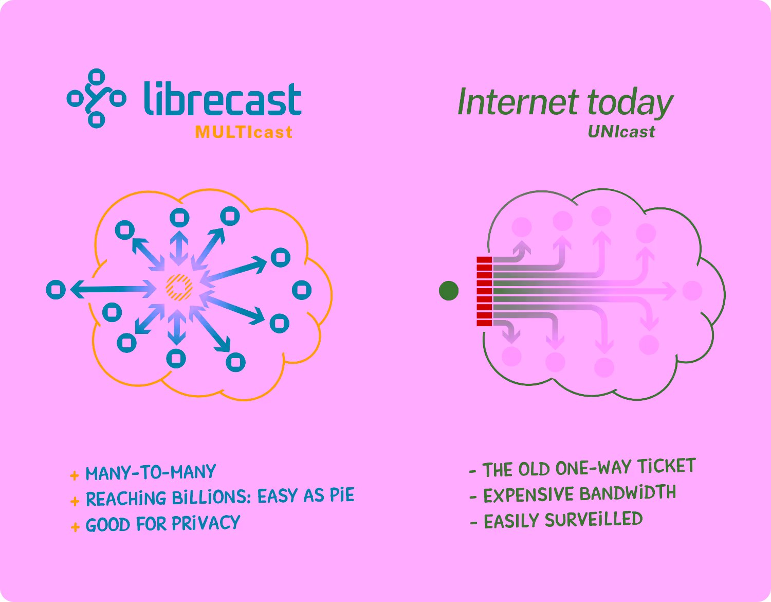
In the eyes of tech nerds Librecast seems to bend the limits of what a network can do. It connects participants in a decentralized, private and secure manner, while discarding established bandwidth concerns:
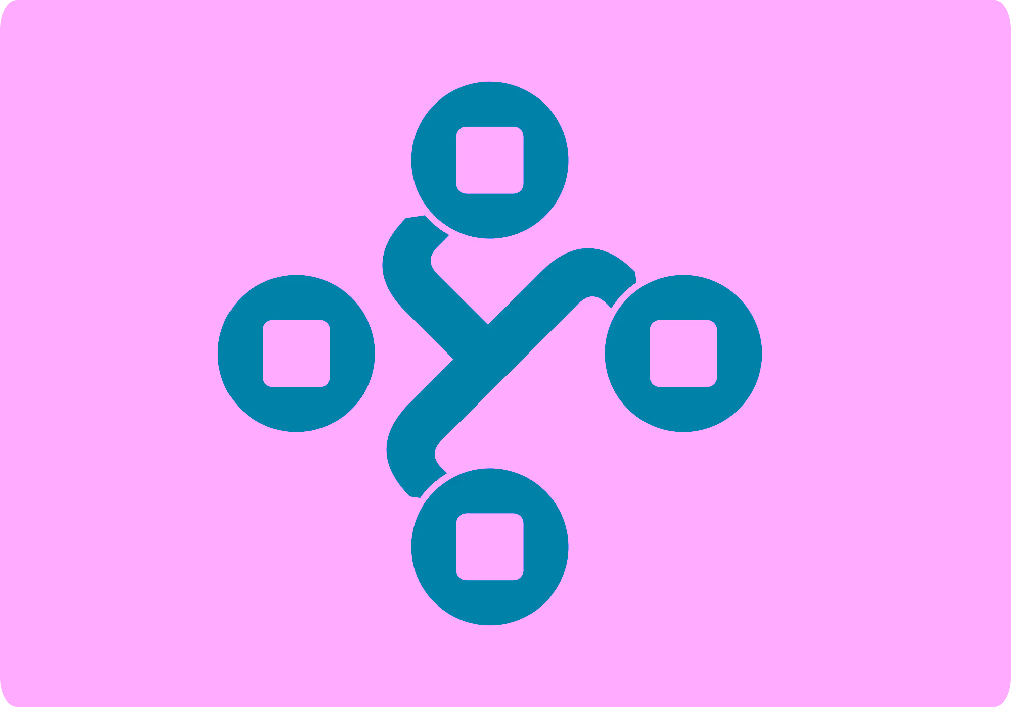
The Librecast symbol captures that very nature of connected non-hierarchical peers in a simple way, including a (yet) disconnected peer, showing the fundamental opt-in approach of the protocol.
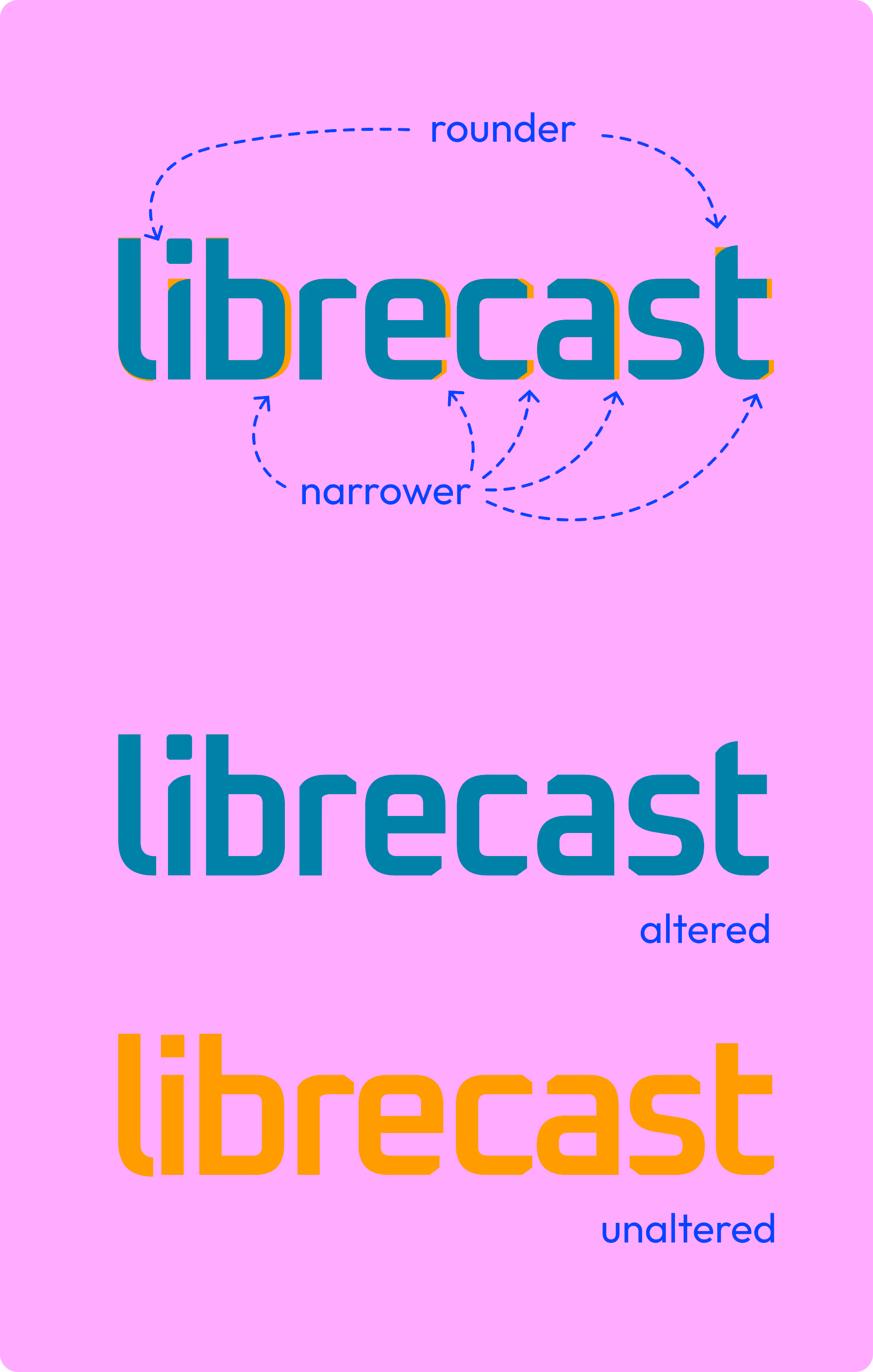
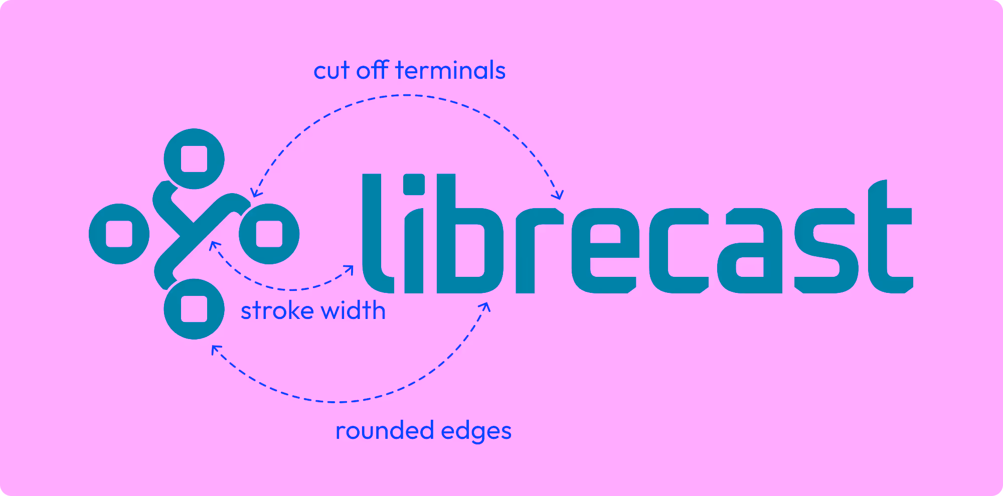
The characteristics of the logotype Oxanium provide most of the DNA for the symbol style, mixing constant font stroke width, rounded edges and cut off terminals. The logos type and symbol share those traits, resulting in a stronger unification of the logo as a whole:
The logotype was also altered slightly for a more perfect fit. Among the changes are a softened dot of the 'i', many characters got narrower, and the stems of 'i' and 't' were rounded off.